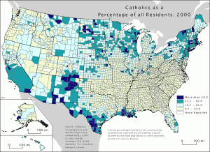
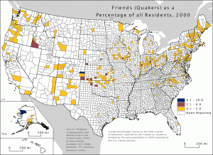
A couple of years ago, LeFalcon sent me a link to a set of maps like these, which codify the counties of the USA by the percentage of the population who adhere to particular religious groups. It’s fascinated me ever since. Below, as an example, is the map for Quakers.
You can see that Quakers are rather thin on the ground everywhere. In their uniformity, they are unusual. The striking thing about the maps is how divided the USA is regionally. So, look at the distribution of Baptists:
And compare it with the distribution of Roman Catholics:

The overall map shows just how strong these regional divisions are.


No comments:
Post a Comment